Our aim was twofold: to make menu items easily accessible and visually appealing while ensuring they weren’t intimidating. Alongside vibrant images, we made sure that food descriptions and selections in the cart were intuitive. We experimented with various designs and settled on one that presented comprehensive information in the simplest and most user-friendly manner.
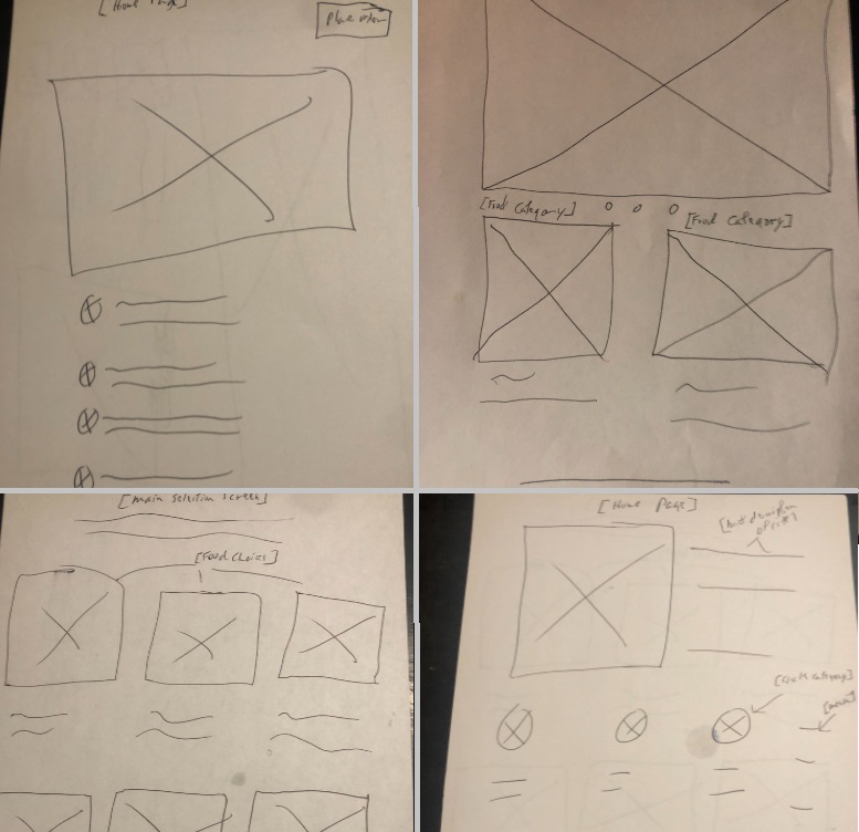
Paper wire framing

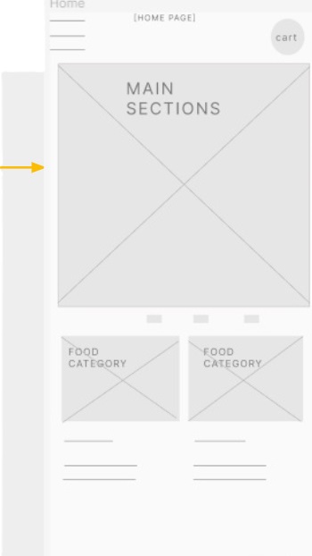
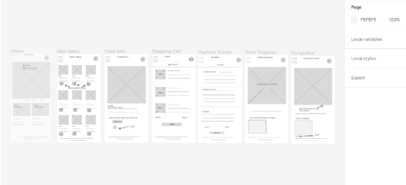
Digital wire framing
As a result of the paper wireframe process this was the decided look. We want to make food types and selections clear as possible.


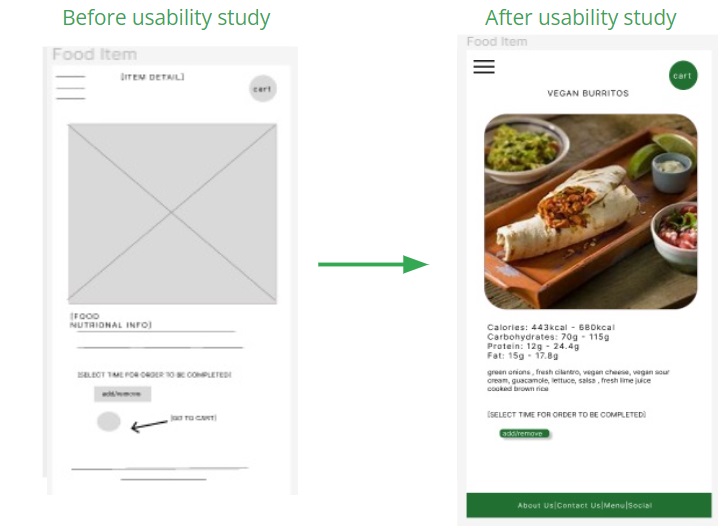
We provided food description and nutritional details. The prior progress page displayed a static icon indicating the time of completion. I revamped it to allow users to set food completion and delivery times, along with an added feature for chat notes if necessary